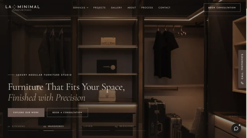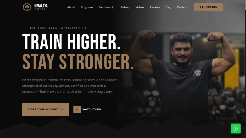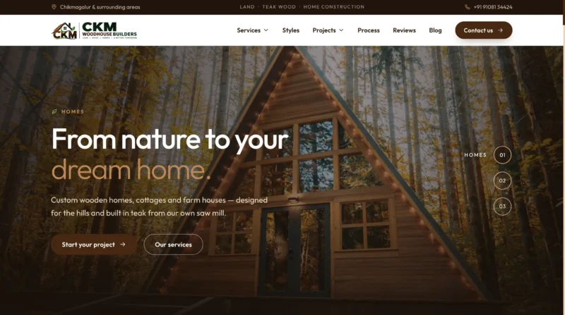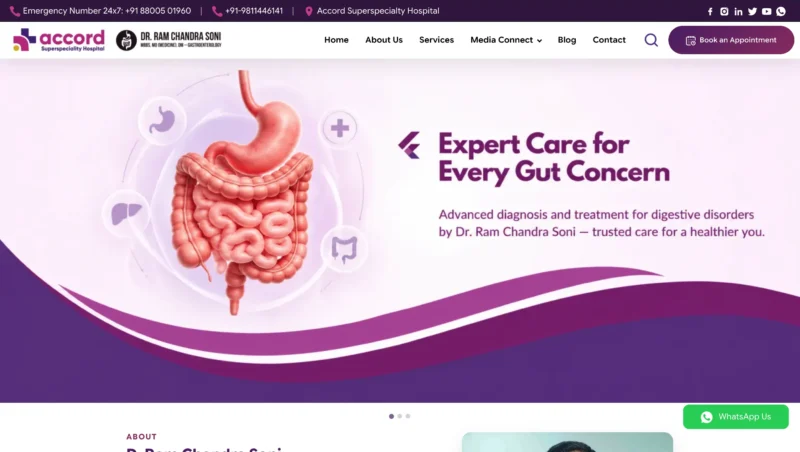
You pay for every click on your ads. If the page those visitors land on is confusing or slow, most of them leave and that money is wasted. A good landing page has one clear job: turn visitors into enquiries.
Here are the 10 elements that make a landing page convert, and how to use each one.
What Is a Landing Page?
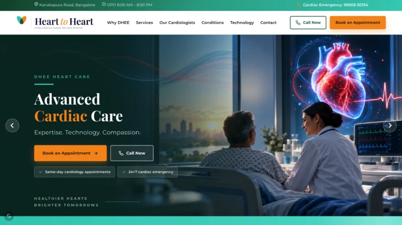
A landing page is a single page built around one offer and one action, such as booking a consultation or requesting a quote. Unlike your main website, it removes distractions so visitors focus on that one step.
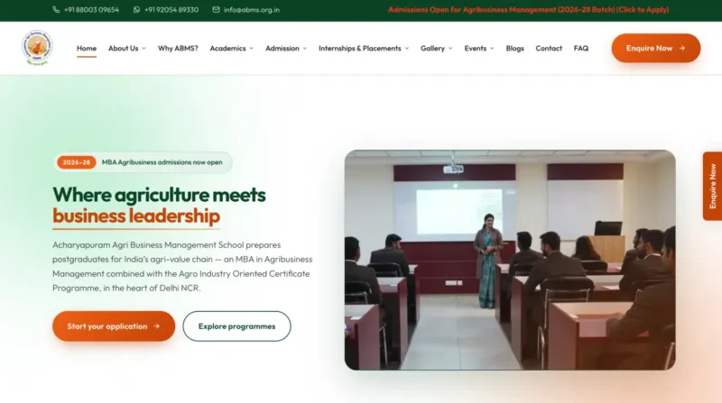
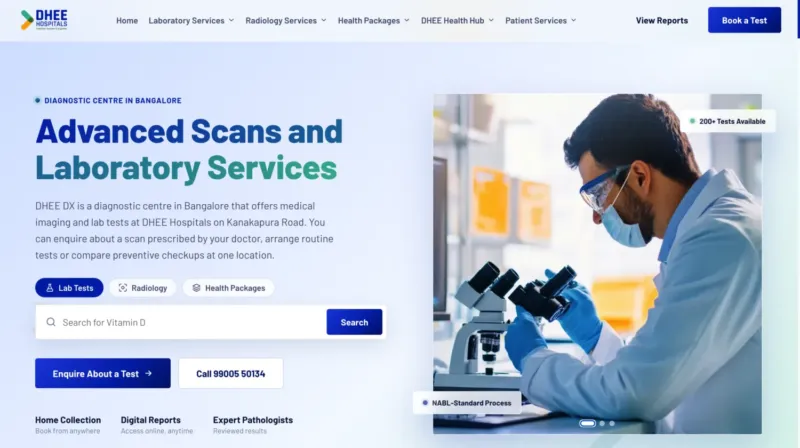
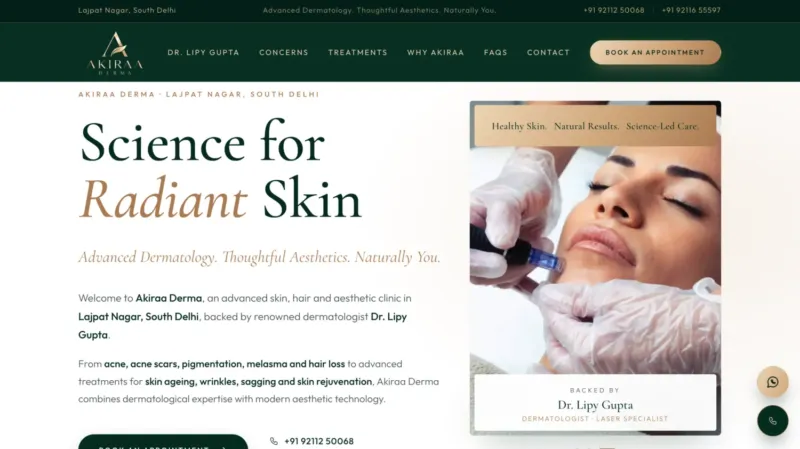
1. A Clear, Specific Headline
Your headline should tell visitors in a few seconds what you offer and who it is for. Avoid vague slogans. Use the words your visitors used when they searched or clicked the ad.
2. A Supporting Subheadline
Use one or two lines to explain the main benefit. What problem do you solve, and what will the visitor get?
3. Message Match With Your Ad
The page must continue the promise made in the ad. If your ad says free consultation, the page should say it too. A mismatch makes visitors feel they are in the wrong place and they leave. Good message match also helps your Google Ads performance.
4. One Clear Call to Action
Decide on one main action and make it obvious. Use a button with specific wording, such as Book a Free Consultation instead of Submit. Repeat the same call to action further down the page.
5. A Short, Simple Form
Every extra field lowers the chance that someone completes the form. Ask only for what you need to follow up, usually a name, phone number and one or two more details. Add call and WhatsApp buttons for people who prefer to talk.
6. Benefits, Not Just Features
People care about what a service does for them. Explain results in plain language, using short points that are easy to scan.
7. Proof and Trust Signals
Visitors need a reason to trust you. Add real testimonials, client logos, ratings, certifications or short case examples. Only use proof that is genuine and that you can back up.
8. Strong Visuals
Use clear, relevant images or a short video that shows the product, the team or the result. Avoid heavy images that slow the page down.
9. Fast Loading and Mobile-First Design
Most ad clicks come from phones. A page that takes too long to load loses visitors before they see your offer. Compress images, keep code clean and test on a real phone. Our speed optimization service can help if your pages are slow.
10. Tracking and a Thank-You Page
After someone submits the form, send them to a thank-you page. It confirms the request and lets you track conversions in your ad accounts and analytics. Without tracking, you cannot tell which campaigns actually bring enquiries.
Landing Page Mistakes to Avoid
- Sending ad traffic to the home page instead of a focused page.
- Adding menus and links that lead visitors away.
- Using long forms for a first enquiry.
- Making claims you cannot prove.
- Never testing and improving the page.
How to Improve Your Landing Page Over Time
Treat a landing page as a work in progress. Look at where visitors drop off, test a new headline or button, and change one thing at a time. Small improvements add up, especially when you are paying for the traffic.
Design and Copy Work Together
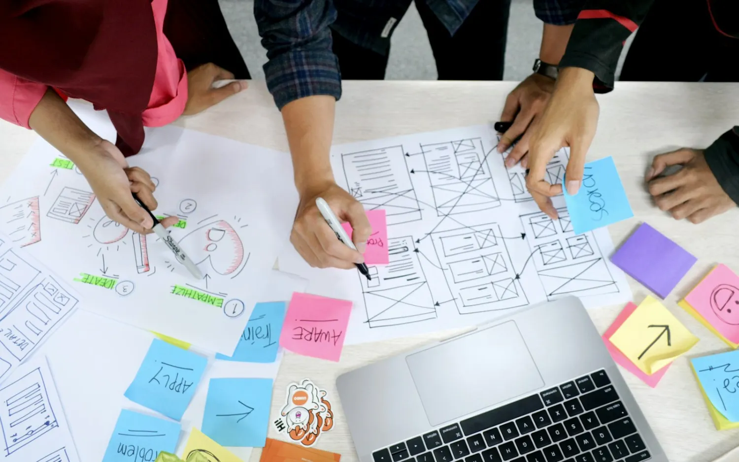
A beautiful page with weak words will not convert, and strong words on a messy page will not either. Good UI/UX design and clear content writing should be planned together from the start.
A Simple Top-to-Bottom Landing Page Layout
If you are not sure how to arrange the elements, this order works for many services.
- Top section: headline, short subheadline, main image and the primary button or form.
- Problem and solution: a few lines showing you understand what the visitor needs.
- Benefits: three to five short points explaining what they get.
- How it works: two to four simple steps so the process feels easy.
- Proof: testimonials, ratings, logos or results.
- Questions answered: a short FAQ that removes doubts.
- Final call to action: repeat the offer and the button.
Visitors should always know what to do next, wherever they are on the page.
Writing Copy That Converts
Words do much of the work on a landing page. A few habits help:
- Lead with the outcome: say what the customer will gain, such as a clinic booking in minutes, not just what you offer.
- Be specific: clear details are more believable than big claims.
- Use the customer’s language: reuse phrases from enquiries and reviews.
- Write short sentences: people skim, so make every line easy to read.
- Make buttons action-based: Book My Free Consultation works better than Submit.
Good copy and good layout reinforce each other, so plan them together. Our guide on writing website content that ranks and converts covers more ideas.
Landing Pages for Different Goals
The right design depends on what you want visitors to do.
- Get a call: show a large, tappable phone button, especially on mobile.
- Fill a form: keep the form short and above the fold, with a clear reason to fill it.
- Start a WhatsApp chat: offer a button with a pre-filled message to make it easy.
- Buy a product: show price, delivery details and a short checkout path.
You can offer more than one option, but make one of them the main choice.
Testing and Improving Without Complexity
You do not need advanced tools to improve a landing page. Change one thing at a time, such as the headline, the button text or the form length, and compare results for a few weeks. Watch conversion rate, cost per lead and the quality of the leads, not only the number. If you run Google Ads, test different ads against the same page, and different pages against the same ad, to learn what drives enquiries.
Conclusion: Make It Easy to Say Yes
A high-converting landing page is clear, focused, fast and trustworthy. Get the headline, form, proof and speed right, and your ads will bring more enquiries from the same budget.
Want a landing page built to convert? Get a free quote and tell us about your campaign.
Frequently Asked Questions
What is a good conversion rate for a landing page?
It varies widely by industry, offer and traffic source. Instead of chasing a number, track your own results and keep improving them.
How long should a landing page be?
As long as it needs to be to answer the visitor’s questions. Simple offers can use a short page, while higher-priced services often need more detail and proof.
Should a landing page have a menu?
Usually not. Removing the main menu keeps visitors focused on the one action you want them to take.
Can I use my home page as a landing page for ads?
It is usually better to use a dedicated landing page, because it matches the ad and has one clear goal.
How many form fields should I use?
Keep it short. Ask for only what you need to follow up, often a name, phone number and one or two details.